
Funko POP: Green Ranger (BOOM Studios)
- Onyx

- Sep 5, 2025
- 3 min read

Go go Power Rangers! This is another Tommy Oliver-based POP, I know! This version of his Green Ranger persona, however, is more in line with the comics from BOOM Studios. They've been doing Power Rangers comics for some time now, and maybe I should get into their work (they have VR Troopers now, too!). But for now, let's take a look at this POP and let's see how he turned out. Let's go!


Makes me wonder if they are going to do more comic book based Power Ranger POPs. Heck, maybe they should do some of the unique Zords?


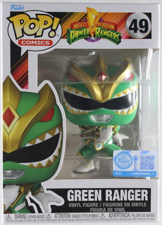
While I'll always be a HUGE fan of the classic look of the Green Ranger(the sentai costume, of course, not the western version), I will welcome BOOM Studio's interpretation of the suit. There are a bit more designs, more depth, and some patterns rearranged to make it look less uniform. Textures are also changed, making the suit less spandex-y. The POP version of this suit, well, I feel, does the comics justice! The enhanced designs, like a much more pronounced dragon-esque helmet, the lining all over the suit, the different patterns on the gloves and boots, they're all present! There are plenty of things to appreciate with this Green Ranger POP mimicking the comic design! Green Ranger looks so much better in this version!

An iconic pose, that much is certain! I do appreciate what they did here, although with POPs, it's hard to replicate the flute in the mouth since the head is so ginormous. He looks very action-y, and his pose is sculpted well, but the 'playing the dragon flute' look doesn't sit well with the POP proportions.

Color-wise, there's a lot to love with the Green Ranger! Although there are some very obvious mishaps on the helmet, especially around the visor and the lips. Obvious enough, but for me, it doesn't take away too much from the rest. When the gold paint is clean, it's clean, the variations in green adds more depth, and the highlights of white, red, and black really does a lot to carry the weight of making Tommy look sharp! All in all, no complaints here.

Both Green Rangers are doing the flute pose, and, again, it doesn't look all that great. Although the 30th Anniversary Green Ranger does look a bit more legit with the flute playing. Also, their Dragon Daggers are very similar, but the comics version really adds more flair.

I wonder if they will ever make a BOOM Studios version of the White Ranger. Honestly, I still prefer Tommy as the White Ranger... but that's just me.

Both from the BOOM Studios universe but alternative from each other... I believe. Then again, The Ranger Slayer was once Lord Drakkon's slave, so there's that.
POP: A buncha Tommies & Kim

I like this version of the Green Ranger! I love the POP too! Although I had my gripes, all in all, it's a good-looking POP with a lot of great things going for it. I'd say he's well worth it and definitely a must for Power Ranger fans.
Until Next Time!


Comments