
Funko POP: Spider-Man 2099 (Across the Spiderverse)


Time for another addition to my Spiderverse POP! This Spidey 2099 is the variant from the Spiderverse movie. Let's not delay and check out this POP, shall we?

I have the Spider-Gwen (or Ghost-Spider) from this wave. Probably the only other one I'm going to be getting from here. This Spidey was, after all, gifted to me by my Special Friend.

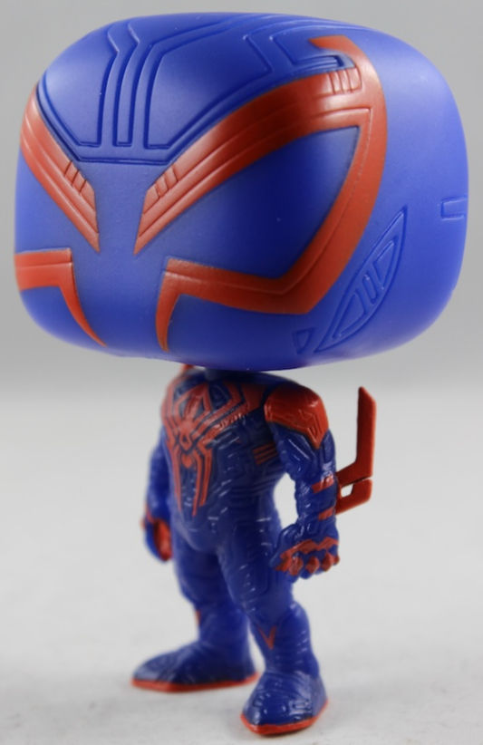
I like the liberties Across the Spiderverse took with Miguel's design. It doesn't deviate too far from the familiar OG look, but it does give it enough to make it stand out as the movie version of Spidey 2099. One thing is that there are a lot of more lines and designs all over him and all of that is sculpted all over the POP. It gives his skin tight blue 'suit' some depth with all that! The rest of this details are also present. Love the 'blades' on his elbows, and his overall presentation with his proportions, despite being stylized, it all looks good. Would've loved to have the spider logo sculpted in, but, hey, there is so much going on already that I suppose it would've been hard to do.

His pose is pretty neutral — almost vanilla. Spidey 2099 is just standing there, not doing the typical web-slinging or action poses most Spider-Men usually get. While some might see that as a miss for Miguel, I’ll die on this hill: a neutral Spidey POP is needed every once in a while. Let him just stand and let his aura do all the talking. This version of Spidey 2099 isn’t the one we know from the comics, so a pose like this actually fits the bill. It also lets collectors fully appreciate all the work put into the sculpt.

The colors are pretty good overall. The red decor is a little messy in places, but nothing too glaring that ruins the aesthetics. However, the color of the head and the body are quite different on my copy. It’s a bit distracting, but nothing that makes me want to complain too much. And yes, I do think a transparent-style cape would look awesome.

The red lines on Miguel's eyes and logo are something to admire.

Classic Spidey POP next to this 2099 Spidey is a sight to see. Maybe I'll need a neutral classic Spider-Man one of these days.

Again, a neutral posed Spider-Man is not the worst thing in the world. It can work.

I'll always prefer the classic look for Spider-Man 2099 over his red-and-white era. And while Across the Spider-Verse Spidey 2099 is not classic, it definitely has similarities.


That cape would've been a good addition, yeah? Maybe next POP, eh?

An awesome addition to my Spider-Verse wall!
This is another variant of Spidey that isn’t a Parker or a clone, and I really appreciate these kinds of Spider-Men. It shows that it’s not just Peter or Miles who get to do whatever a spider can. Even though the movie version of Miguel is quite different from his original comic roots, this POP is still fantastic. It also gives me hope that we’ll see more versions of him once the next Spider-Verse movie comes out.
Until Next Time!



Comments