
Funko POP: Scorpion (MK 11)
- Onyx

- Jun 30, 2025
- 2 min read
Updated: Jul 16, 2025

Intense Music
MOOOORRTAAALLLL KOOOOMBAAAATTT!!!! Yeah! That's right! We have ourselves a Mortal Kombat POP amidst our grasp! This isn't mine, but my special friend's. Yes, she has a very diverse taste, and she doesn't shy away from Fatalities and gore.


A small wave, for sure. It's an easy wave to finish and, honestly, had they made Sub-Zero a bit more 'standard' than making him all Olaf-like. Still, Kitana looks cool too!


Scorpion's design had changed drastically throughout the years. For the most part, however, the yellow and black color scheme was always there to let us know which Ninja we are looking at. Scorpion's Mortal Kombat XI added more layers (literally and figuratively) to his iconic costume, this time around giving him katanas to go with his 'get-over-here-spear'. His design also became more intricate, adding more eastern themes, which, for all those complex designs, Funko did well to translate it into POP form. He's got his katana, armor platings, straps, belt, and all of that. He looks really good and probably one of Scorpion's better-looking outfits. I'm glad his POP form mirrors how awesome this outfit looks!
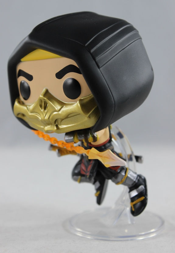
His pose is definitley all action. Jumping up in the air with his spear in tow, Scorpion is ready to plunge that fiery weapon through someone's chest and do some serious damage. It's a well done pose, backed up with a figure stand that allows for some aerial-looking attack. Just not a familiar pose for Scorpion--least not for me--but I'm a casual Mortal Kombat player, so maybe this is a thing he does? Point is, it looks great!

As I mentioned, Scorpion's main colors are black and yellow, but those have been updated with some colors that contrast and complement the two main colors. There are hints of red, silver for the armor plating, heck, even gold is sprinkled everywhere. His weapon is also painted nicely with the flame effect on the chain, giving it a painful, burning look. It's all cleanly done, and honestly, I have no complaints!

The two rivals but from different representations of each other! I'd say that, despite Scorpion being from MK XI and Sub-Zero being from MK X, they both look good next to each other. I do wish that Scorpion had flaming colored eyes like Sub-Zero's ice colored ones.
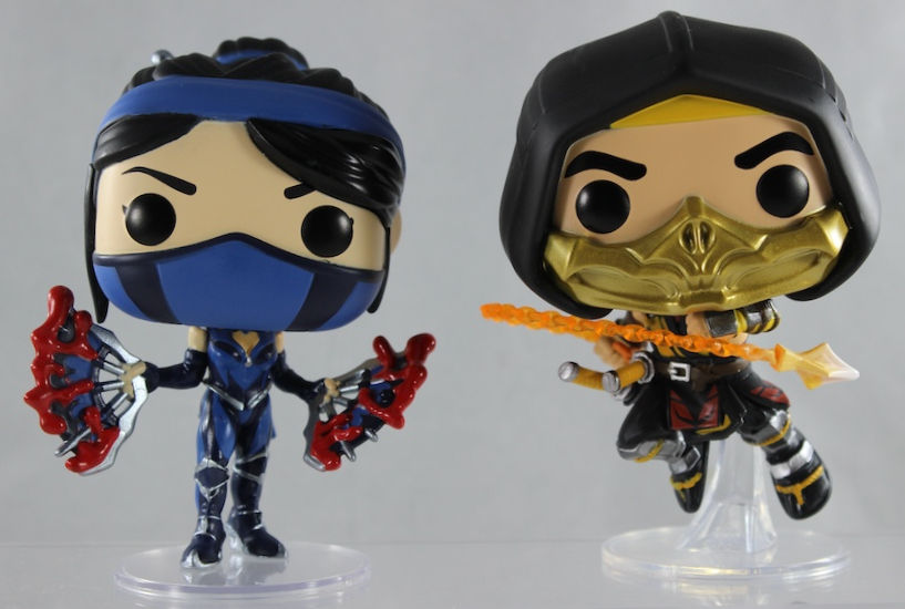
The Mortal Kombat XI designs just hit! Yes, their outfits are a bit on the complicated side, but, honestly, it's not overtly too much. It doesn't hit that line of 'over-designed' like they did with Mortal Kombat X. Kitana and Scorpion just look good together.
POP: Mortal Kombat

Scorpion is an awesome POP. There are a lot of good details with this little guy, a very action-like pose, and the colors are just well executed! I highly recommend it. My friend and I are impressed and appreciate this as part of our collection. Well, it's her collection, but I feel like both our POPs are merging.
Until Next Time!


Comments