
Funko POP: Arachknight - Walgreens Exclusive


I never read the Infinity Warps storyline, but I get the idea. It reminds me a lot of the Amalgam comics era. Doubt we’ll ever get POPs of those, but here we are with Arachknight! Let’s take a look at this one and see how he holds up.
Truth be told, I would probably have liked that version of Iron Hammer more than the one I got. Maybe.


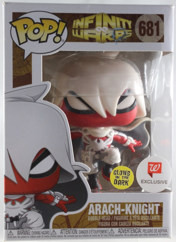
The concept is simple: Spider-Man and Moon Knight got warped into one being. Much like Amalgam, it pulls distinct features from both characters and creates something outlandish, unique, and pretty cool. Seeing Moon Knight’s cowl on a Spider-Man body is something I didn’t know I needed. It keeps that gloomy, dramatic vibe while still retaining Spidey’s iconic look underneath. The bright white of Moon Knight mixes with Spidey’s red palette, complete with a new insignia. This POP handles all of that really well. The flowing cape and cowl, the spider symbol on the chest, the utility belt with pockets — the overall design is executed cleanly. No complaints here.

I love Arachknight’s pose! He’s gliding down toward some unsuspecting criminals after a web-sling, and you can already tell it’s game over the second he lands. The cape is flared out in that classic Batman-style moment — the last thing the bad guys see before lights out. It looks awesome and is pulled off nicely.

The red and white color scheme is surprisingly intriguing. As a fusion of Spider-Man and Moon Knight, those two colors have to be the primary ones (even if the blue is missing). Funko replicated it well, with different shades of white playing off the red, plus some grey and black accents. The paint is clean overall. That spider logo on the back of the cape is especially well done and pops against the darker backdrop.

He is the knight. He has the power. And he has the responsibility to keep the innocent safe.

Yes, this POP has a glow-in-the-dark gimmick! It's a bit fickle, and it's not as clean as I would like my glowing POPs to be.

Still, that logo on the back is executed really well — you can see the spider clearly! The cape creating a dark backdrop just adds to the overall visuals.

Classic right next to warped! Arachknight really does look like a well-balanced combination of Peter Parker and Marc Spector's other identity.

Symbiotes and supernatural versions of Spider-Man. Or maybe I just wanted to drop in a few different variants of Spidey.

POP: Spiders, Ghosts, & Monsters
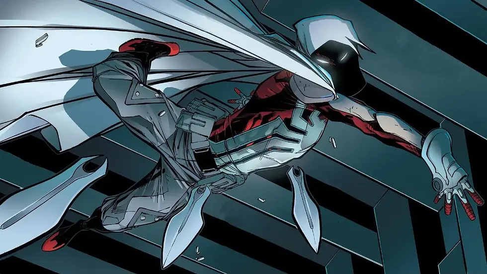
I love how his design looks as art. He wasn't going to be a mainstay of the status quo, but it's another good variant of Spider-Man (and Moon Knight) to have in the Spider-Verse realm.

Arachknight has a lot of cool design elements that translated great into POP form. The pose is dynamic, the colors are sharp, and overall it’s a good-looking Spidey variant. Is it a must? Depends on how much you dig this particular Spider-Man/Moon Knight mash-up. He’s got plenty going for him, and I don’t mind him joining my Spider-Verse collection at all.
Until Next Time!


Comments