
Funko POP: Spider-Man (1st Appearance / Amazing Fantasy #15)
- Onyx

- Jul 23, 2025
- 3 min read

Now this Spider-Man is a genuine legend. From his appearance in Amazing Fantasy 15 from 1962, a POP dedicated to that is always going to hit the feels. This is also an 80th anniversary celebration for Marvel, so there's that. SO, without further ado, let's take a look at this POP, shall we?


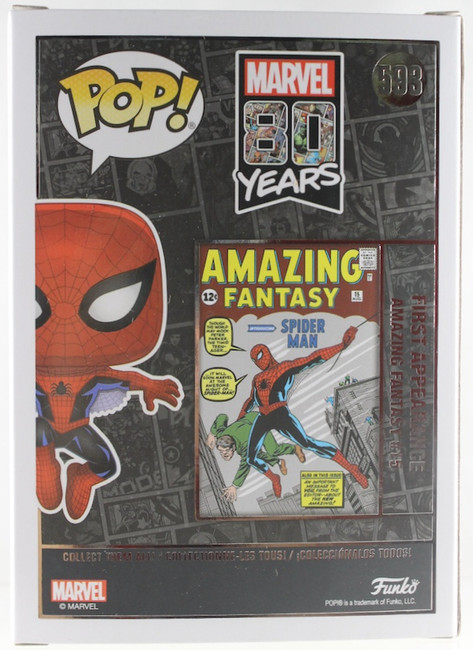


One of a kind. I love this box. It's got that glossy lining and the comic book pages as background along with showcasing that special comic book from way back when. Needless to say, this Spidey could've been easily been MIB, but since I'm building a Spiderverse, no way he's gonna stay inside this prestigious box.


Spidey's outfit is classic and easily recognizable. Other than small changes here and there, the outfit had stayed loyal to its first appearance (Black Symbiote, Iron Spider, and Spiderverse characters aside). The web lines, the classic red & blue, the spider logo on his chest, the giant 'bug/spider' on his back, the eyes, and the web pits, these are all recognizable parts of Spidey's outfit that appeared way back when in Amazing Fantasy 15. While the web pits do get taken out and the logo and eyes changed throughout the years, for the most part, we can all recognize Spider-Man from his first appearance to now. In his POP version, all the 1st appearance aesthetics are all present and sculpted with such care. I love the prominent web lines all over his body, those small/squinted eyes, the simple spider logo, these are all present and sculpted! The web pits are also there and they serve their purpose for the sake of continuity.

Classic Spidey isn't posed particularly too crazy, but he does have a jumping/gliding posture going on. I definitely think this is fitting since it gives us collectors a chance to appreciate every sculptwork put in without getting a vanilla posed Spidey. I think this is a win here.

As far as the colors go, I think they went above the norm. Usually there's very little to no shadowing when it comes to common POPs. The black overshadowing (pun) the blue is a nice little hint that Spidey is jumping from the shadows and springing into action! The rest of the POP looks amazing, so there's no complaint at all! The shadowing is a highlight for this one.

Vanilla Spider-Man next to First Appearance Spider-Man! It's a nice contrast next to each other! I do think that 1st Appearance can be a base Spider-Man POP for future Spiderverse POPs... maybe.

Classic poses and concepts next to the classic Spider-Man.

These are some classic Spideys! Sure, neither the 1977 nor the Sentai Spidey is going to make the top list for canonical Spider-Man suit, but they are a nice contrast next to Spidey's first appearance!

This POP is a footnote since it pays homage to Spidey's first appearance. For that, it's a must. Is it an Amazing POP? Well, yeah. Great sculpt, amazing coloring, the pose is fitting, and all in all, it looks awesome. Highly recommend! Pricepoint, you might want to keep digging for sales since I do see some hiked up prices. All in all, I'd say the price I got it for is more than worth the value.
Until Next Time!


Comments