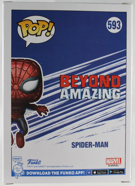
Funko POP: Spider-Man #593 (Diamond) - Box Lunch Exclusive
- Onyx

- Oct 12, 2025
- 2 min read

Yes, another Spider-Man! And, yes, this is a repaint of a POP I already have! This one is a special limited edition that came 'free' when purchasing an "x" amount from Boxlunch. Don't ask me what "x" was because I forgot.

If the pose didn't give it away, I don't know what would've. But, yes! This is a repaint of POP: Spider-Man (First Appearance/Amazing Fantasy #15); the Spider-Man POP that celebrated 80 years of Marvel. Since they are 99% identical, the review for this POP is going to be quicker. If one wants to see my usual opinion on this POP with more depth, just use the 80 years of Marvel POP for reference.

Being a repainted POP, it's not going to have anything to preview. Of course, it's part of the "Beyond Amazing". It's also an exclusive, so yeah, it's a simple box.


This is a diamond version, that much is obvious. Full transparency: there are some things that a diamond POP does that takes away from the original details and/or painting from the original. I found myself not being a fan of this variation of POPs after handling a couple of them. In this case, the paint is the one that suffers. The extra shadowing and the effort to make this as accurate to the source material are nearly lost in the process of giving it the diamond gimmick. The details and sculpting are almost lost within the extra texturing, which is unfortunate. Does it still look good, though? I'd say it's still a good-looking POP, but if we are comparing it by itself and not with the original version in mind.

I've always liked this pose, and it still shines with the diamond version.

As stated prior, some of the diamond texturing takes away from the shadowing this particular POP received.

Even up close, some of the diamond texturing just doesn't look good.

Comparing him to a 'vanilla' Spider-Man doesn't help his case. The diamond is not doing it any favors.

I believe it was POP: Lady Deadpool where I started realizing that the Diamond versions aren't as glammed up as they seem to be. There truly are some awesome details with Lady Deadpool that got lost with all the texturing and the likes.

I know I spoke very negatively of this POP, and honestly, if it wasn't a promotional POP, I wouldn't have gone out of my way to grab him. It's still a nice mold of a POP, and glimpses of the original POP do peek through, but all in all, I'd go for the original. Recommended? No. But if it's along the lines of 'really cheap' and/or free, I'd say it's got its worth. I prefer the original 80 Years of Marvel POP.
Until Next Time!


Comments